
In today’s kitchens, monochrome metal schemes are giving way to artfully layered finishes. Designers agree that mixing metals adds depth and personality – what The Spruce calls “the 2025 kitchen hardware trend” that’s here to stay . By combining two or three coordinated metals instead of striving for one flat look, a kitchen instantly feels more curated and warm . In fact, experts report that using mixed-metal fixtures “brings depth and character” to a space, making it seem more intentional . Trendsetting examples abound – from star kitchens featuring gold and black palettes to celebrity homes mixing silver and brass – proving that the era of “matchy-matchy” kitchens is over. Luxury publications and our own Top Kitchen Trends of 2025: Colors, Materials & Smart Accessories highlight how nuanced metal pairings are now a hallmark of cutting-edge design.
Metal mixing isn’t just style over function; it’s a savvy response to modern color psychology. Warm metals (gold, brass, copper, bronze) have yellow-red undertones that feel cozy and opulent, while cool metals (stainless steel, chrome, nickel, silver) reflect a crisper, more minimalist vibe . Neutral tones like matte black, gunmetal, or deep bronze act as chameleons, easily tying disparate finishes together . For example, a gold and black kitchen design embodies contrast: matte black cabinetry grounded by glinting gold handles looks both dramatic and balanced . Importantly, a metal’s true “color” is defined by its undertone – two so-called brass finishes can clash if one reads reddish and the other yellow. Designers stress working with undertones: pair warm brass with similarly warm copper , or use black as a neutral bridge when blending a warm brass faucet with a cool chrome sink . When harmonized correctly, these tonal balances make a mixed-metal kitchen feel intentionally layered rather than chaotic.
The Science of Color, Finish & Reflectivity
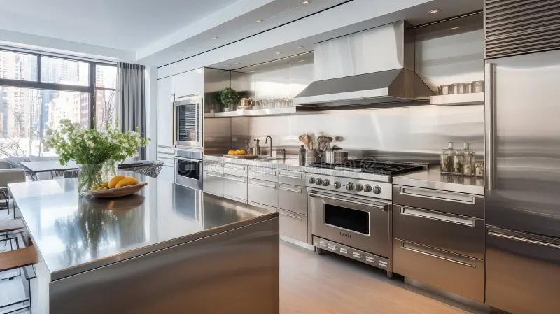
At the heart of mixing metals is color and physics. Polished metals have high specular reflectivity – think mirror-bright steel or gold. These surfaces bounce nearly all incident light, “brighten spaces,” and create a sense of spaciousness . The flipside is that polished chrome or brass will amplify every fingerprint, smudge and micro-imperfection. By contrast, brushed or satin finishes scatter light across their fine grain, yielding a softer luster. Brushed surfaces hide small scratches and skin oils , and produce a subtle glow instead of harsh glare. For instance, a brushed stainless-steel backsplash quietly reflects ambient light, whereas a #8 mirror-polished stainless backsplash would create vivid highlights .
From a material standpoint, brushed textures have tiny grooves that trap abrasion; this diffuses highlights. Polished finishes lack this micro-texture, so they reflect like glass. Matched-up in a design, a brushed nickel faucet paired with polished gold hardware can fail visually: the gold’s mirror shine and the nickel’s matte sheen fight for attention. In science terms, their reflectivity indices differ drastically. (Polished stainless steel, for example, can reflect over 80% of visible light , whereas a brushed finish might only reflect a fraction of that.) The result is a perceptual mismatch: the gold “pops” while the nickel looks flat, making the combination seem disjointed.
Understanding these optics helps avoid missteps. Warm metals (brass, copper, rose gold) tend to absorb a touch more of the blue end of white light and re-emit a golden hue; cool metals reflect true white light with a bluer cast . In practice, this means a sunlit kitchen will look “warmer” with brass fixtures, and cooler (sleeker) with chrome or stainless. Because of this, designers often use lighting to “bridge” mixes – for example, a matte-black pendant with brass trim ties a gold-toned bar pull to a cool under-counter fridge. Ultimately, sophisticated kitchen design treats metal finishes like paint colors or fabrics, carefully balancing their temperature and sheen so surfaces compose beautifully under light .
Base Metals vs Accent Metals: How to Choose Roles
A sure-fire way to succeed is by assigning roles. Select one dominant base metal for large surfaces (cabinets, appliances, faucets) and one or two accent metals for secondary elements (hardware, lighting, trim). Industry guides suggest the dominant metal cover roughly 60–80% of the scheme . For instance, you might choose matte black or brushed nickel as the base (60–70% of visible metals) and reserve antique brass or copper for about 20–30% of the details . This aligns with the “80/20 rule” often cited by designers : roughly 80% of one metal and 20% of the other. Mixing three metals typically follows a formula like 60%/25%/15%, so the scheme never feels overstuffed. In all cases, the hero metal (the largest percentage) becomes the backdrop. Melissa Sakell of Anthony Wilder Design suggests assigning one metal per category – e.g. cabinet pulls in brass with a nickel faucet – so each finish has its domain .
Choosing which metal plays which role depends on style and context. A neutral base metal (like stainless) can let a warm brass or black fixture pop as the accent. Conversely, a bold black appliance suite might be the canvas, with gold or brass lighting as eye-level accents. The key is to distribute metals evenly: don’t cluster all of one finish in one corner of the kitchen. Break up finishes so your eye moves smoothly through the space . For example, a brass pendant light at eye height might be balanced by brass cabinet pulls at hand level, while a stainless range hood and sink in the lower cabinets ground the look. This visual hierarchy – alternating metals between task (hand) level and sight (eye) level – keeps the design coherent. Think of it like interior “color-blocking” but with metal tones.
The Most Popular Metal Combinations (2024–2025)
Contemporary kitchens love certain pairings. Below are six cutting-edge duos and the aesthetics they complement:
- Gold + Black. This rich, high-contrast pairing reads as modern luxury or polished transitional. Matte black cabinets or countertops with gleaming gold handles (or a gold faucet) add drama and sophistication . It can suit Art Deco-inspired glamour or even Japandi interiors, where black elements combine with warm wood and gold accents for an organic elegance. Homes & Gardens calls silver-and-gold a “winning combination” ; analogously, gold and deep black create depth and opulence.
- Champagne + Stainless Steel. Champagne is a subtle warm silver-gold hue (often achieved via PVD). Paired with classic stainless steel, the look is polished yet soft. This duo suits minimalist and Scandinavian kitchens: both finishes are light-reflective but aligned in the cool-silver spectrum, so the effect is airy and restrained. In more luxurious schemes, champagne accents (think faucets or lighting) against stainless appliances introduce warmth without straying far from a sleek palette. In essence, stainless acts as the neutral base, while champagne offers just enough glow for contrast.
- Gunmetal + Brushed Gold. Gunmetal (a dark gray PVD steel) with a warm brushed gold is a confidently modern choice, often found in industrial-glam kitchens. The gunmetal’s charcoal tone anchors the design, while the soft matte gold hardware or fixtures provide a warm shimmer. This combo fits upscale industrial and modern-luxe styles, adding richness to otherwise neutral schemes. Foster’s PVD line even markets sinks and hobs in coordinated Gunmetal, Gold and Copper finishes , enabling seamless integration. Imagine a brushed-gold faucet rising from a dark gray island – the result is at once edgy and elegant.
- Brass + Matte Black. Warm brass hardware on matte black cabinetry (or vice versa) is a proven classic for contemporary kitchens. It spans styles from industrial (black metal with gold pops feels gritty yet refined) to modern minimal (black-and-gold details against white surfaces) . This pairing also suits Japandi: black metal elements paired with natural wood and a few brass accents can feel refined and global. Nina Hendrick’s guide calls satin brass + matte black “modern, yet warm” – perfect for a chic Scandinavian or transitional space that needs a focal accent.
- Bronze + Chrome. A medium bronze tone with polished chrome is a sophisticated transitional mix. The bronze’s brown warmth complements cool chrome, yielding a balanced contrast. This combination works well in kitchens blending traditional and modern (think a classic bronze sink or faucet with chrome lighting). It also suits minimalist spaces that need a subtle earthy accent. Because chrome is so reflective, using bronze with a matte or brushed texture can unify the pair without overwhelming.
- Copper + Gunmetal. Copper’s rich orange warmth against gunmetal gray creates an industrial-glam or rustic-luxe vibe. Copper light fixtures or a farmhouse sink pop against a gunmetal faucet or cabinet legs. This edgy blend is common in urban loft or eclectic kitchens, where unfinished metals are embraced. When done right, it fits a modern-eclectic or industrial style – copper brings an heirloom feel while gunmetal keeps the palette grounded.
Each of these palettes finds echoes in real kitchens. The Spruce notes “polished nickel with antique brass” and “matte black with chrome” as top pairings , underscoring how neutral-cool metals (nickel, black) mingle with warm accents (brass, gold). Similarly, designers often pilot mixed metal kitchen hardware using one metal family at one height and another elsewhere for rhythm. By choosing the right combination and placement, you can align with a Scandinavian, minimalist, industrial, or modern-luxe aesthetic as desired. For instance, a gold+black scheme leans glamorous, while copper+gunmetal skews industrial. (For more trend context, see our Top Kitchen Trends of 2025: Colors, Materials & Smart Accessories.)
How PVD Coatings Changed Metal Mixing Forever
Physical Vapor Deposition (PVD) technology has revolutionized finish design. Unlike traditional plating, PVD creates a thin, covalently bonded coating that transforms stainless steel into virtually any color. In practice, engineers evaporate metal alloys (e.g. titanium- or zirconium-based compounds) in a vacuum chamber to deposit coatings. The result: consistently colored, ultra-hard surfaces. For example, a TiN-based PVD layer yields a true gold finish, while ZrN produces a champagne tone; TiCN yields deep black, and CrN gives gunmetal gray .
PVD’s material science benefits are profound. Coated fixtures measure around 1000–2500 Vickers on hardness tests – far above the 200–400 of bare stainless – so they resist scratches and dents. The coating is so durable it won’t chip off; rather, it forms a thin, even sheath that “holds up better than many traditional treatments” . As Aquacubic explains, PVD faucets and sinks “are highly resistant to scratches and keep their color over time” . In real terms, a premium PVD faucet might look as-new years after installation, whereas a cheap platted faucet would show wear.
Color stability is another PVD boon. Because the process is tightly controlled, manufacturers can ensure identical undertones across product lines. Installers can therefore mix and match PVD-coated fixtures (even of different types) with confidence that the gold tone or gunmetal tone will match exactly. In fact, high end companies like Kohler and Crauf’s own fixtures are all PVD-plated to ensure such consistency: for maximum harmony, designers often specify premium PVD-coated fixtures from Crauf, which offer stable undertones and durable finishes ideal for modern mixed-metal kitchens. These fixtures (referenced in How PVD Coating Transformed the Look of Kitchen Fixtures) exemplify the uniformity new coating tech makes possible.
PVD also improves maintenance. The dense coating makes surfaces water- and oil-repellent, so they rarely show fingerprints or smudges . Compared to traditional stainless, PVD surfaces “naturally repel water and oil… making it much less prone to showing fingerprints and water spots .” They also resist corrosion and harsh chemicals better – important for kitchen sinks and taps. Though PVD fixtures can cost 20–40% more upfront, the lifecycle is far longer . In short, PVD coating has made mixing metals easier and more durable than ever: designers can freely combine luxe gold and deep gunmetal knowing the finish quality and color will endure.
Warm vs Cool Metals: Understanding Temperature Harmony
“Warm” and “cool” describe how metals feel in the space’s color scheme. Warm metals (brass, copper, bronze, champagne-gold) tend to absorb and reflect more of the red-yellow wavelengths, giving a cozy, rich aura. Cool metals (stainless, chrome, nickel, silver) reflect blue-white light, yielding a crisp, modern effect . When mixing, one strategy is to let one temperature dominate while using the other for contrast. For example, a kitchen might be primarily cool-silver (white cabinets, chrome appliances) with warm brass accents to add coziness. The “temperature” harmony is like mixing warm and cool paint: balance is key.
Interior pros note that mixing a distinctly warm metal with a cool one can create intentional contrast . A little warmth can enliven a cool grey-white kitchen, and conversely a cool piece can freshen a gold-heavy scheme. Black or gunmetal pieces often serve as neutral “third wheels” that tie warm and cool together . (Coastal Cottage Amelia likens black metal to “Switzerland” of a color palette .) Importantly, undertone consistency often matters more than nominal temperature. A champagne gold (with a subtle rose cast) will read differently than a “yellow gold” brass, so pair finishes whose base hue is compatible . In practice, designers will avoid blatant clashes (e.g. a bright brass with a stark blue-tint nickel) unless offset by neutrals or complementary materials (like warm wood).
In sum, use the temperature of metals to your advantage: warm metals for a cozy, inviting feel; cool metals for sleek modernity; and neutral/dark metals to tie disparate finishes together. This creates a harmonic temperature palette that feels intentional, whether the overall vibe is Scandinavian serenity, industrial edge, or high-gloss luxury.
Texture Matching: Brushed vs Polished vs Matte
Another dimension is surface texture. All else equal, mixing the same metal in different finishes can still clash if the sheen is unmatched. Brushed or satin textures have fine linear grain and a softer, low-gloss look. They diffuse light and veil imperfections . Polished finishes are mirror-like: any smudge, fingerprint or dust particle glitters back at the eye. Matte or powder-coated textures (like matte-black finishes) have virtually no shine at all, appearing flat and tactile.
For visual harmony, it’s wise to “stay in the same finish family” whenever possible. If one metal is polished, it pairs best with other polished or semi-polished metals. Conversely, mixing a polished and a matte surface of the same color may look odd because the shiny one catches light differently. For example, pairing a polished gold faucet with a textured bronze sink can result in one element dominating visually. Many designers avoid mixing highly reflective and very muted sheens together unless an intermediate finish (like brushed) softens the transition.
Pragmatically, brushed finishes are often used where wear is likely – cabinet hardware, for instance – since their micro-scratches only add to the matte character . If one accent metal is highly polished and another is brushed, ensure their colors and temperatures are in sync, or use fixtures that intentionally combine them (e.g. a light fixture with brass highlights on a brushed-nickel body). In general, too much polish can be glaring: avoid a kitchen full of shiny chrome with a shiny gold, which can look garish and tire the eye. Instead, mix textures: perhaps polished gold and satin brass, or shiny hardware with matte lighting. This variety adds depth, but must be balanced to avoid visual “noise.”
Mixing Metals in Hardware, Faucets & Sinks
Hardware and plumbing fixtures are the most visible opportunities for mixed metals. Faucets, handles, knobs, and sink basins each have roles. Designers often say: treat each category separately. For instance, choose one finish for all cabinet pulls and a second finish for the faucet and knobs . Melissa Sakell recommends “assigning one finish to each category of hardware” – e.g. all drawer pulls in brass, all faucets in polished nickel . This avoids every little piece competing, and ties each part of the room together.
When selecting a faucet finish, consider its context. A sink with lots of foot traffic might favor a fingerprint-resistant PVD finish, whereas decorative fixtures might be polished or brushed. Whether to match the sink or stand apart depends on your strategy. A stainless steel sink is a classic base that pairs well with nearly any faucet (brushed brass, nickel, or black). Alternatively, a statement sink (such as a copper farmhouse basin or matte-black undermount) can become the “hero,” with the faucet and hardware chosen as complements. For example, pairing a copper sink with a brushed gold faucet and black pulls creates a rich, layered look.
Sink finish choice is similarly impactful. Many kitchens opt for the default stainless sink to echo appliances. But dark or colored sinks (oil-rubbed bronze, black stainless, matte gunmetal) are increasingly available via PVD. These allow you to harmonize sink color with faucet or hardware. In a mixed-metal design, the sink can either match one of the metals or act as a neutral. For instance, a gunmetal sink (neutral gray) will not fight with brass fixtures.
Faucets and sink aside, kitchen accessories and appliances should also be considered. People often forget the small stuff – imagine a gold pot rack in a silver-and-black scheme. Best practice is to keep the primary metals consistent across even accents (lighting, stools, utensils) or to use black neutrals there. In short, treat faucets, knobs, and sinks as you would paint or textiles: pick their finishes deliberately. Premium fittings (see Kitchen Remodeling: 10 Fixtures That Make the Biggest Visual Impact for inspiration) will have better color fidelity, so match them confidently.
Common Mistakes Homeowners Make
Even with good intentions, it’s easy to slip up. Common pitfalls include:
- Too Many Finishes. Sticking to three or fewer metals is crucial . A palette of four or five colors usually looks disjointed. Many experts advise an 80/20 or 70/30 split at most between primary and secondary metals . If you find yourself adding a fourth metal, reevaluate – it often creates chaos.
- Ignoring Proportions. Violating the 80/20 (or 70/30) rule is a frequent mistake. For example, using 50% brass and 50% silver is usually too stark and unbalanced. Instead, choose one dominant finish for the bulk of hardware/faucets and reserve about 20–30% for the accent. Distribute accents evenly: don’t cluster all the brass pulls on one wall and all the nickel hardware on the opposite wall – that segregates the design.
- Clashing Undertones. Mixing metals that look like opposites can backfire if their undertones clash. A warm gold with a cool blue-tinged nickel, for instance, can look discordant without a bridging element. As Moss Pure’s founder advises, if you do mix metals, “stick to two types or colors throughout the kitchen” . In practice, that means pair warm with warm or neutral/dark in between, and likewise keep cool with cool unless anchored by black or stone.
- Cold/Warm Clash. Similar to undertones, uncontrolled mixing of warm and cool metal categories can feel jarring. Without a neutral to tie them, mixing bright chrome and bright brass often yields a visual clash. That said, a designer-guided contrast (e.g. matte black plus chrome ) can work if one metal clearly anchors the scheme. A safe bet is always to let one temperature family dominate (for example, mostly warm metals with a cool accent) .
- Over-Polished Surfaces. An all-shiny environment can be both impractical and aesthetically tiring. Overuse of polished finishes can overwhelm the eye and make maintenance nightmarish (every drip or print shows). Mixing too many polished metals (for example, a mirror-bright chrome faucet with polished brass pulls) often ends up looking gimmicky. Matte or satin finishes usually feel more grounded.
- Mismatched Accessories. Homeowners sometimes forget about small elements. A stainless sink alongside golden towel bars or a copper vent hood with black hardware can visually fragment the design. Always check that appliances, lights, and decor (even electrical outlets!) respect the metal story. For example, incorporating a white countertop to bridge warm and cool tones can help – a neutral backdrop absorbs differences. In essence, avoid random metal pops; each piece should feel intentional.
Avoiding these mistakes comes down to intentionality. Designers often stress testing combinations in the real space before committing. And as one guide notes, “don’t mix two finishes that are too similar” – brushed nickel and polished chrome, for instance, can look mismatched side by side . Keeping finishes coherent in sheen and temperature is key. When you adhere to the 80/20 rule, respect undertones, and balance placement, even tricky mixes can work wonders.
Designer-Approved Metal Mixing Formulas
Based on professional practice, here are some formulaic guidelines:
- Two-Metal Formula – 70% Base, 30% Accent: Common advice is to let one metal cover roughly three-quarters of surfaces and use the second as a pop. For example, a stainless steel-heavy kitchen (cabinets, appliances) might have 30% of surfaces in brass or matte black knobs and lights . Alternatively, a matte-black appliance suite (60–70%) could be warmed by gold lighting (30–40%). This 70/30 split (close to the 80/20 rule) keeps one finish dominant for cohesion.
- Three-Metal Formula – 60% / 25% / 15%: If using three metals, start with a 60% dominant finish, a 25% secondary, and a 15% accent. For instance, a modern scheme might be 60% brushed nickel, 25% matte black, and 15% copper. Many designers say “three is the magic number” ; beyond that, the design risks feeling cluttered. Think of it like designing a necklace: one large chain metal and two smaller accent chains.
- Hero-Metal Rule: Choose a “hero” metal that sets the tone – it gets center stage (often at eye level). This might be the finish of your light fixtures or range hood. Then, use the others at lower or higher levels. For example, if brass pendants are hero (eye-catching), make the faucet or cabinet hardware in a subdued matte black or stainless as the supporting cast. Conversely, a bold black backsplash might be the hero, with brass hardware the accent (hand-level). This vertical placement strategy ensures the eye-first metal grabs attention while the second reinforces it.
- Contrast Placement: Deliberate placement of contrasts can add drama. Place one metal predominantly where guests look first (e.g. lighting fixtures, open shelving at eye height) and another on functional elements (drawers, appliances). This “runway” effect leads the eye. For instance, polished gold pendant lights over a black island will draw focus up, balancing matte black faucets on the island. In essence, scatter accents so that your eye moves from one finish to the next (e.g. brass pulls, then brass trim on a vent hood). This spatial distribution follows design composition rules, creating rhythm and preventing any one area from feeling too neutral or too flashy.
These templates, of course, are starting points – adjust ratios for your space and style. The constant is intentionality: if your formulas follow a clear 60/30/10 or 80/20 split, the mixed finishes will read as planned, not haphazard. As one designer puts it, “limiting your palette to two or three metal tones keeps the look intentional rather than overwhelming” .
Final Thoughts
Mixing metals in a modern kitchen is both an art and a science. When done thoughtfully, it transforms a sterile, flat scheme into a deeply personal, layered environment that feels high-end and lived-in. The keys are understanding color temperature (warm vs cool), surface physics (reflectivity, texture), and proportion. Advances like PVD coatings have expanded the palette of stable, durable finishes , freeing designers to experiment boldly. Remember to choose a hero metal, respect undertones, and apply proven formulas (such as the 70/30 rule) to guide your choices.
By balancing the elegant glow of brass or gold with the sleek neutrality of stainless or black, you create dynamic contrast. A crisp chrome appliance can look fresh next to a warm bronze faucet if bridged by creamy counters or wood. As highlighted in Kitchen Remodeling: 10 Fixtures That Make the Biggest Visual Impact, a single striking mixed-metal fixture can pull a kitchen together. Ultimately, mixed metals are a hallmark of upscale, forward-thinking design – signaling confidence and attention to detail. With science-backed insight and creative composure, you can mix metals without mistakes, achieving a kitchen that is as technically sound as it is stunning.