
Curtains do more than just block light; they shape your interiors and influence how colour flows across the space. Choosing the right curtain combination is especially essential in Singapore homes, where natural light, compact layouts, and air-conditioned comfort must all work in harmony.
Day and night curtains may offer dual-function versatility, but unless they’re coordinated with your room’s palette, they can look like an afterthought. With that, here’s how to match day and night curtains with interior colour schemes effectively, whether you’re using soft neutrals or bold hues.
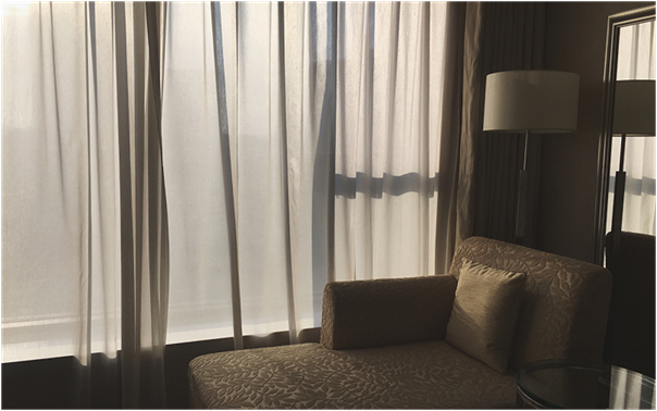
Understanding Day and Night Curtains in Design
Day and night curtains are typically a layered system: the day curtain is often a sheer fabric that lets in filtered light while maintaining privacy, and the night curtain is a heavier drape that provides full coverage. Many households also incorporate blackout curtains to manage light and heat more efficiently. Consider these curtains an extension of your wall, flooring, and furniture colours, not merely as functional window coverings.
Matching Neutral Colour Palettes with Curtains
Neutral palettes (beige, grey, taupe, white) dominate many homes in the city-state due to their timeless appeal and compatibility with modern interior design. Day curtains in off-white, ivory, or light grey maintain brightness for such schemes and keep the space feeling open. Night curtains in a slightly darker shade like charcoal, mocha, or greige create contrast without clashing.
Meanwhile, homeowners using blackout curtains with neutral interiors must choose the ones with textured fabric to add depth without disrupting the visual harmony.
These combinations also work well with Scandinavian or minimalist design themes.
Pairing with Warm Colour Palettes
Warm tones such as terracotta, mustard, burgundy, and warm wood finishes lend a cosy and intimate atmosphere. Night curtains in these settings should enhance the warmth, not overpower it. Opt for earthy curtain fabrics like cinnamon, rust, or chocolate brown. Soft creams or warm beige sheers provide a subtle transition for the day curtain layer.
Additionally, it’s best to avoid using blackout curtains with synthetic gloss finishes as these may reflect warm tones poorly and disrupt the balance. Instead, matte fabrics with natural textures like linen blends complement warm interiors better.
ALSO READ: The Essence of Day and Night Window Curtains: A Blend of Functionality and Elegance
Working with Cool Colour Palettes
Homes that feature cooler palettes, blues, greens, and soft lavenders, require curtains that either match or subtly contrast to avoid a cold, clinical feel. Day curtains in icy blue or pale mint can reflect daylight gently. Night curtains should be kept in mid-to-dark tones of slate, navy, or forest green for visual weight.
Stick to deep, rich tones with a slight sheen if installing blackout curtains in bedrooms that follow this colour direction. This style is especially suitable for urban apartments and contemporary HDB flats where cooler palettes are popular.
Accent Colour Strategies
A space with a primary neutral or light base but uses bold colours for accents—such as throw pillows, rugs, or wall art—may use curtains to either reinforce or balance those highlights. Day and night curtains, in this case, can become an intentional design statement. For instance, pairing emerald green night curtains with brass decor elements works well in an art deco-inspired space. Alternatively, if you prefer understated elegance, keep day curtains neutral and select blackout curtains with colour-block borders or subtle prints that pick up your accent hues without dominating the space.
What to Avoid When Coordinating Curtains
Avoid selecting curtain fabrics that are too similar in colour and texture to your walls; this flattens the room. Also, do not mismatch cool-toned walls with overly warm curtain tones unless done purposefully for contrast. Always consider lighting, natural and artificial, as fabric colour may appear drastically different depending on the time of day. Furthermore, ensure the lining of blackout curtains complements the room even when visible during the day.
Conclusion
Pairing day and night curtains with your interior colour palette isn’t just about style; it’s also about function, balance, and enhancing the usability of your living space. Whether you choose subtle sheers or dramatic blackout curtains in Singapore, your selections should support the existing decor rather than distract from it. Stick to consistent tones, experiment with textures, and always test samples in your home lighting before committing.
Visit Window Art Gallery to transform your space with perfectly coordinated curtains.